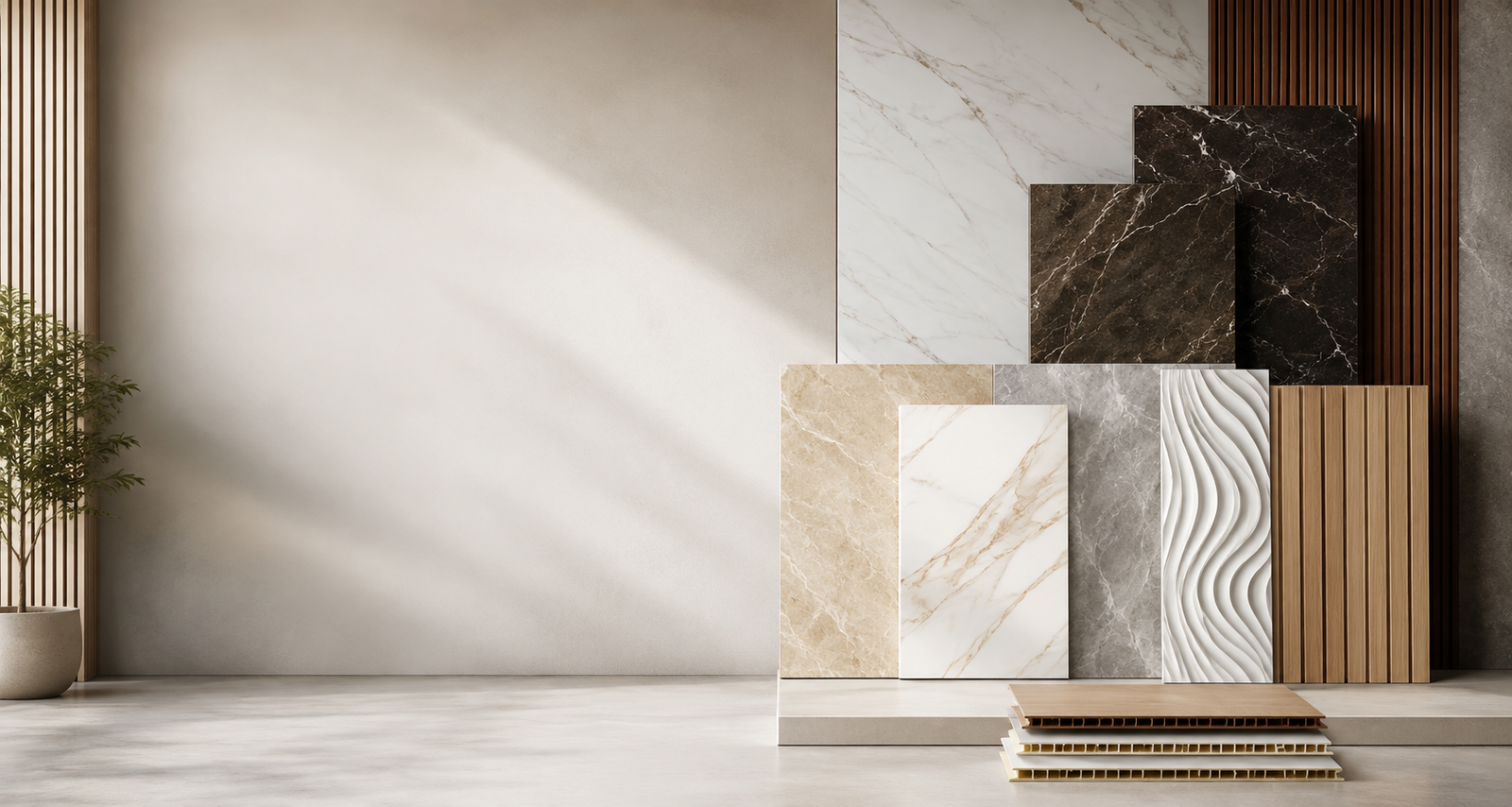
There is a quiet shift happening in interior design. The conversation has moved past colour palettes and statement furniture, and landed firmly on texture. Walk into any well designed home, hotel or studio space today, and the first thing you notice is not the colour scheme. It is how the surfaces feel, how they catch light, and how they sit against each other.
This is the language of layered interiors. It is the difference between a room that photographs well and a room that lives well. This guide is for homeowners, designers and specifiers who want to understand how texture works, why it matters, and how to use it without overwhelming a space.
Why Texture Has Replaced Colour as the Design Lead
For decades, interior design started with a colour palette. You picked a wall colour, then chose furniture and accessories around it. The materials were often secondary.
That order has reversed. Contemporary interiors now lead with material and finish, and let colour follow. The reason is simple. Colour can be repainted in a weekend. Material defines the architecture of the room, and architecture is what people respond to on a deeper level.
A matte plaster wall, a fluted timber surface, a honed stone feature and a soft wool rug do more for a room than any colour scheme can. Each surface absorbs or reflects light differently, which gives the space depth even before furniture is added.
This is why luxury wall panels, natural stone, brushed metals and tactile fabrics now sit at the centre of design briefs. They build rooms that feel considered rather than decorated.
The Five Texture Families Every Room Needs
A well balanced room rarely uses a single texture. It uses several, in different proportions, and lets them play against each other. Most successful interiors draw from five texture families.
Hard and Reflective
This is the surface that catches the light and bounces it back. Polished stone, high gloss panels, mirrored glass, lacquered joinery and chrome fittings all sit in this group.
Reflective surfaces expand a room visually and add a sense of crispness. They work especially well in compact spaces, contemporary kitchens and dressing rooms. Used in moderation, they keep an interior feeling clean and modern. Overused, they make a room feel cold and impersonal.
Hard and Matte
These are the surfaces that hold light without bouncing it. Microcement, lime plaster, honed marble, brushed concrete and matte stone effect wall panels are the obvious examples.
Matte surfaces give a room weight and calm. They make a space feel grounded. This is the texture family that most modern luxury interiors lead with, because matte finishes photograph beautifully and feel quiet to the eye.
Soft and Tactile
This group covers everything you want to touch. Bouclé upholstery, wool rugs, linen curtains, brushed cottons, velvet cushions and felt acoustic panels all belong here.
Soft textures are how a room becomes liveable. A space with only hard surfaces feels like a showroom. Adding even one significant soft element changes the whole atmosphere. In bedrooms and living rooms, soft textures should make up the largest proportion of the material mix.
Linear and Rhythmic
This is one of the defining textures of contemporary architecture. Wooden slat panels, fluted glass, reeded joinery, vertical timber cladding and ribbed plaster all create rhythm through repetition.
Rhythmic surfaces add direction to a room. Vertical slats lift the eye and make ceilings feel taller. Horizontal lines lengthen a space. This is the texture family that most rooms underuse, and it is often the missing layer in interiors that feel slightly flat.
Organic and Natural
These are the surfaces that bring the outside in. Live edge timber, natural stone with strong veining, rattan, woven jute, dried botanicals and unfilled travertine all sit here.
Organic textures add warmth and human scale to a room. They are particularly important in modern interiors, where the architecture can otherwise feel too controlled. A single organic element in a clean contemporary space transforms how the room feels.
The 60-30-10 Rule for Texture
Designers often talk about the 60-30-10 rule in the context of colour. The same logic applies, and arguably works better, when applied to texture.
Around sixty percent of the room should be your dominant texture. This is usually a matte surface, because it sets the calm baseline. Plaster walls, a matte stone floor, soft upholstered seating.
Around thirty percent should be a supporting texture that contrasts with the dominant one. If the dominant is matte, the support is often linear or organic. Wooden slat panels behind a sofa, a feature wall in fluted plaster, a timber ceiling detail.
The final ten percent is the accent. This is where reflective or sculptural finishes earn their place. A marble fireplace surround, a high gloss console, a 3D textured feature panel in the entrance hall.
This proportion stops a room from collapsing into either monotony or visual noise. It is the framework most well designed spaces follow, even when the designer is not consciously applying it.
Designing Room by Room
Texture works differently in different rooms. The brief for a bedroom is not the brief for a kitchen. Here is how the principles translate across a home.
The Living Room
The living room has to handle multiple uses. It is where people relax, host guests, watch television and read. The texture mix needs to support all of those modes.
The most successful living rooms lead with matte and soft textures. A plaster or matte stone effect feature wall, a deep low profile sofa in bouclé or brushed cotton, a wool rug with subtle pile variation. Linear texture often appears behind the television, where a wooden slat panel or fluted timber wall anchors the media zone without dominating it.
The accent here is usually stone. A marble coffee table, a stone hearth, or a sculptural side table in travertine. One stone element is enough.
The Bedroom
Bedrooms should feel quiet. This is the room where soft and matte textures should do most of the work, with linear texture as the supporting layer.
A common approach is a full height wooden slat panel behind the bed, replacing the traditional headboard. The slat panel adds warmth, rhythm and acoustic softness in one move. Around it, linen curtains, a wool rug underfoot and a plaster ceiling complete the calm palette.
Reflective surfaces should be limited in bedrooms. A small mirror, a brushed metal pendant, perhaps a lacquered bedside drawer. Beyond that, gloss tends to disrupt the restfulness of the room.
The Kitchen
Kitchens are the room where reflective and hard surfaces earn their place. They are easier to clean, more durable and visually crisper. High gloss cabinetry, stone effect splashbacks, polished worktops and metallic fittings all work here.
The risk is the room becoming clinical. The fix is a single soft or organic counterpoint. A live edge timber breakfast bar, a textured plaster wall on the dining side of the island, or wooden slat panels lining the bulkhead above the cabinetry. One warm element rebalances the whole space.
The Bathroom
Bathrooms benefit from a confident material lead. Most well designed bathrooms pick one strong surface and let it dominate. Marble wall panels in a master ensuite, microcement throughout a wet room, or stone effect PVC decorative sheets in a guest bathroom.
The supporting textures here are usually limited. Brushed brass or matte black brassware, a single timber stool or bench, a soft cotton bath mat. Restraint is what makes bathrooms feel premium.
The Entrance Hall
The entrance hall is the room where first impressions are set. This is the one space where sculptural and 3D textures often justify themselves fully. A 3D textured feature wall, a stone clad console area, or a fluted timber wall sets the tone for the whole home.
The hall does not need to be the most comfortable room. It needs to be the most memorable one. Texture is how that happens.
How Light Changes Everything
No discussion of texture works without lighting. The same surface looks completely different under different lighting conditions, and this is where most amateur specifications fall short.
Matte surfaces respond best to soft, diffused light. Direct downlights can make them look flat or chalky. Wall washers and ambient lighting bring them to life.
Linear textures, like wooden slat panels and fluted finishes, need grazing light. This means light placed close to the surface and aimed along the direction of the lines. It pulls the rhythm forward and creates shadow lines that give the wall depth.
Reflective surfaces need to be lit indirectly. Direct light hitting a gloss panel creates harsh hotspots. Light bouncing off ceilings or adjacent walls reads far better.
Organic textures, like live edge timber or natural stone with strong veining, benefit from warm, slightly directional light. It picks out the grain and the natural variation, which is the whole reason these materials were chosen.
The rule that holds across all four categories is the same. Specify the lighting and the surface together. Treating them as separate decisions is the most common reason interiors look better in design boards than in real rooms.
The Quiet Power of Acoustic Texture
Texture is not only visual. It is acoustic. And acoustics are one of the most underestimated factors in how a room actually feels to spend time in.
Hard, reflective surfaces bounce sound. A room with stone floors, plaster walls, glass coffee tables and a leather sofa will feel echoey and exhausting after twenty minutes. Conversations become harder, music feels harsher, and people unconsciously want to leave.
Soft and slatted surfaces absorb sound. Wooden slat panels with a felt backing are particularly effective, which is why they appear so often in modern open plan homes, restaurants and offices. Acoustic comfort is a significant part of why these rooms feel calm.
When specifying for a new project, walk through the material list and ask how much of it is absorbent. If everything is hard, the room will sound wrong even if it looks correct. Adding one or two acoustic surfaces is usually enough to rebalance a space.
Common Texture Mistakes to Avoid
A few patterns come up repeatedly in projects that do not land as planned.
The first is using too many textures at full volume. Marble feature wall, gloss kitchen, fluted timber hallway, 3D textured bathroom, bouclé everywhere. Each element is fighting for attention, and the room loses coherence. Pick one or two textures to lead, and let the rest support.
The second is matching every surface to the same finish. A bedroom with a matte timber floor, matte timber wardrobes, matte plaster walls and matte linen curtains feels static. Texture only works through contrast. A reflective or organic counterpoint is what makes the matte read as a choice rather than a default.
The third is ignoring scale. A delicate 3D pattern in a vast double height living room disappears. A bold fluted wall in a small ensuite overwhelms it. The pattern scale and the room dimensions need to match.
The fourth is forgetting the floor and the ceiling. Texture is often planned only for walls and furniture. The floor is one of the largest surfaces in any room, and the ceiling is the most overlooked. Both should be considered as part of the material composition.
Building a Texture Palette Before You Buy Anything
The best way to avoid mistakes is to build a texture palette before specifying a single product. This is a small set of physical samples, not a digital mood board, that you can hold against each other and view in the actual light of the room.
A working palette usually includes a dominant matte sample, a supporting linear or soft sample, an accent sculptural sample, and a single organic counterpoint. Four to six pieces is enough.
View them in daylight and in evening lighting. Place them on the floor of the actual room. Live with them for a few days. The combinations that still feel right after that test are the ones to specify.
This is the step most projects skip, and it is the step that separates a coherent interior from a collection of individually attractive choices.
Bringing Texture Into Your Project
Texture is the most powerful tool in modern interior design, and the most rewarding to get right. A considered material palette transforms how a space looks, sounds and feels, and holds its quality far longer than any colour scheme can.
At SKY Pannel, our role is to help specify the surfaces that anchor the room. Whether that is a sculptural marble feature wall, a calm matte stone effect surface, a rhythmic wooden slat installation, a soft 3D textured backdrop or a clean high gloss finish, the right material is the foundation everything else builds on.
Order samples, browse the collection, or speak with our specification team to start building your texture palette.
Frequently Asked Questions
How many different textures should one room have?
Most well designed rooms use three to five textures, with one dominant, one or two supporting and one or two accents. More than five tends to feel cluttered. Fewer than three tends to feel flat.
Can you mix wood and stone in the same room?
Yes, and many of the most successful modern interiors do exactly that. The pairing works best when one material leads and the other supports. A stone feature wall with a timber floor, or a wooden slat feature wall with a stone hearth, both read well.
Is matte always more premium than gloss?
Not always. Matte tends to read as calm and architectural, while gloss reads as modern and crisp. The right choice depends on the room and the design language. A high end city apartment can lean gloss successfully. A countryside home is usually better in matte.
How do I add texture to a rented home?
Focus on the layers you can change without altering the structure. A textured wool rug, linen curtains, a sculptural side table, framed mirrors and tactile cushions can transform the texture profile of a room without touching the walls or floors. Removable panel solutions can also be considered for feature walls.
Does texture affect property value?
A coherent, well executed material palette contributes meaningfully to perceived quality, which influences how buyers respond during viewings. The finish should be considered alongside the layout and the lighting as part of the overall presentation.
What is the easiest texture to add to a flat room?
A linear or rhythmic surface is usually the fastest way to lift a room that feels flat. A single wooden slat feature wall, fluted joinery detail or ribbed plaster panel adds depth and direction without requiring the whole room to be reworked.
How long does it take to design a balanced texture palette?
Once samples are gathered, most palettes settle within a week of viewing them in the actual space. The temptation to keep adding options usually weakens the final result. Restraint takes longer to commit to than complexity, but it is what makes interiors feel resolved.
Are sculptural 3D textures still in style?
Yes, when used with restraint. The trend has moved from large repeating patterns to softer, more organic reliefs that read almost like plasterwork. One sculptural wall in an entrance hall or behind a bed remains one of the most striking moves in contemporary interior design.
Start Your Texture Palette with SKY Pannel
A well designed room is not about more. It is about the right few things in the right proportions. The material palette is where that decision is made.
Browse the SKY Pannel collection, request samples, or speak to our specification team to begin.
